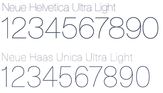
In fact in the year of 1959 Hoffmann made a deal withĭ.Stempel established in Germany to make use of the tyoeface via a Linotype machine. Sans serif typefaces, Hoffmann decided to make the Neue Haas Grotesk availableĪlso for machines. In order to make this type face stand out from the other This immediately becameĪ hallmark of Contemporary Swiss design as it was applied and embraced by lots Grotesk was of a huge success from the very beginning. Typeface appeared at the Graphic 57 trade show. These where the characteristics in which resulted the typeface to be dense and vigorous The extraordinary characteristics of this new typeface wereĬonsistently horizontal stroke termals, large x-height and the extremely tight spacing. Which they had exchanged drawings, proofs and comparisons with the old Grotesksīetween them. For the upcoming months Hoffmann and Miedinger worked together in

Redesign a brand new Haas Grotesk Typeface.īeginning of the year 1956, they had started to work on the so called Neue Haas Salesman and also a designer with the name of Max Miedinger in order to This is when Eduard Hoffmann had hired a former Hass

Which was quite favoured in the appearance of the International Typographic Style

Least favourite than competitors such as the Bertholh’s Akzidenz Grotesk in It allstarted from the 1950’s when the type foundry with the name of Haas,established in Switzerland identified a reduction with it comes to their salesof the Sans Serif – Grotesk typography.


 0 kommentar(er)
